

Do you have a decorating project? What if your choice of colors could influence everything else?
How do you balance the colors in your decor? Do you want to create a calming yet warm atmosphere? Do you want to avoid cluttering your interior but also avoid using only white and neutral colors?
Discover our tips for choosing the right colors for the right rooms in your home!
Color theory: the color wheel
Let's start at the beginning: color theory, or the art of combining colors! Color theory includes several elements: the color wheel... colors, The color scheme and color temperatures. This is always with the aim of creating the most harmonious combinations.
The color wheel includes:
- Primary colors: There are three of them: red, yellow, and blue.
- Secondary colors: created using combinations of primary colors (pfor example purple or even green).
- Tertiary colors: created from a mixture of secondary and primary colors.
Color theory: color scheme
Next comes the color wheel, which allows you to combine these colors logically. This is called a color scheme, the aesthetic basis for creating your first palette. There are several types of color schemes to help you find your perfect combination:
- Complementary : complementary or opposite colors on the color wheel
- Intermediate supplementary insurance: three colors: the main color and the colors adjacent to its complement
- Triadic: three colors from equidistant points on the color wheel
- Monochromatic: different shades and depths of the same color
- Analogous: the main color and the colors on each side of the color wheel
- Neutral : uses a color that has been reduced by adding black
- Achromatic: no color, just blacks, whites and greys
- Secondary: green, purple and orange used together
What colors for which room in your home?
Colors influence our emotions, our concentration, and our moods! Hence the importance of choosing them carefully and according to the different spaces in the house.
Generally speaking, warm colors (yellow, orange, red) are associated with love, passion, anger, and happiness. Conversely, cool colors (blue, white) have a calming effect and are associated with serenity, calm and peace.
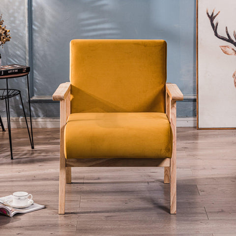
Yellow
Yellow also brings energy. It is considered stimulating and inspiring thanks to its warm and welcoming nature. It is associated with the sun, energy, and creativity because it is said to stimulate the intellect.
Be careful, though, because yellow can also have a negative effect. It could bring feelings of frustration and anger. Therefore, it should be used sparingly.
Use yellow:
in the kitchen (lemon yellow)in the dining roomin the living room: Louis armchair, Stockholm bench
Blue

Blue is considered soothing and calming. It is associated with peace, tranquility, loyalty, serenity, and protection. It is also said to promote intellectual thought.
However, blue is a cool color that needs to be lit appropriately. Dark blue is associated with sadness, so be careful; everything hinges on choosing the right shade and achieving balance. Combine it with warmer colors to create harmony.
Use blue:
in the roomin the bathroomin the living room (royal blue, turquoise blue): Kiruna armchair, Soka pouf, Fuji poufin the kitchen (teal blue): Nora chair
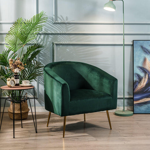
Green
Green has many beneficial properties: relaxing, stress-relieving, and stimulating to concentration. It is the color of appeasement, calm, loyalty, serenity, authority, and protection.
Use green:
- in the room: Narita bedside table, Nishio console,
- in the bathroom
- in the living room: Akita TV stand, Soka pouf, Fuji pouf Bolge armchair
purple
Purple is associated with luxury and creativity, but also with magic, creativity, joy, fertility, and sensuality. Lighter shades of purple, like lilac, have the same virtues as blue. They bring calm and serenity.
Use purple:
in the room
The pink
The color pink is vast! Between candy pink, pastel pink, coral pink, and raspberry pink, there are many differences. Yet it is always the color of passion, love, and freshness.
Use pink:
- in the room: Fjord pouf
- in the bathroom

Black and white
The advantage of white is that it goes with everything and brightens a space. However, be careful not to create an overly cold atmosphere. Adding off-white can bring a warmer touch. White is associated with innocence, purity, integrity, cleanliness, and also with completion, which can have a more or less positive connotation.
Black, on the other hand, can be frightening! Yet, used sparingly, it can create depth or highlight a decorative element or a space. Be careful, though; if used incorrectly, black can darken a room. We associate black with power, prestige, luxury, mystery, drama, and eccentricity.
Use black and white:
- in the office: Soro chair
- in the living room: Gothenburg library, Monroe coffee table
- in the room: Oslo bench
- in the dining room: Tablincoln bar stool
Grey
Gray is often thought of as a bland color. While neutral, gray actually has a wide range of shades that complement many other colors. It's associated with sophistication. Gray is ideal for any room in a home.
Use grey:
- in the living room: Diana armchair
- in the office: Houston office
- in the dining room: Kobe chairs, Newport dining table
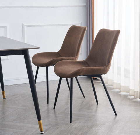
The brown
From taupe to beige-brown, brown has many shades. It's a warm color associated with earth, stability, and serenity. It's particularly important to combine it with other colors to avoid an all-brown look, which can be oppressive.
Use brown:
- in the living room: Koge chair
- in the room
- in the entrance: Tokai shoe cabinet
The Red
Red is considered stimulating and attractive. It is associated with danger, passion, energy, warmth, adventure, and optimism. It is not recommended for bedrooms, especially a child's bedroom.
Use red:
- in the living room
- in the dining room
The orange
Orange is warm and stimulating. It is believed to increase productivity and self-confidence because it provides energy. It is associated with stability, assurance, and warmth.
Use orange:
- in the living room
- in the dining room

Okay, but where do we add color?
There are no rules here! Colour can be used everywhere, there's no question of holding back.
Do you have a pattern idea? Have you always dreamed of using a candy pink element? Trust yourself, you can use colors in a thousand and one ways:
- In large areas: add a coating, paint a wall, a floor or high up on the ceiling, add a rug
- by touches: accessory, photo print, object, lamp
- thanks to the furniture: table, couch
- thanks to the material used: natural, clear
Depending on the trend and your style: modern, chic, designer, classic, original, or more daring. The perfect decor is above all the one that best reflects your tastes!
Conclusion
To choose the colours for your decoration, you can draw on several areas of knowledge: colour theory, the meaning of colours and the rooms where it is advisable to use them.
However, as the saying goes, "there's no accounting for taste!" Since colors don't have the same psychological effects on everyone, it's up to you and only you to choose what you like. Take this challenge as a game!


